


Emma Louise Ingham
Company
Branding
Details
THE BRIEF
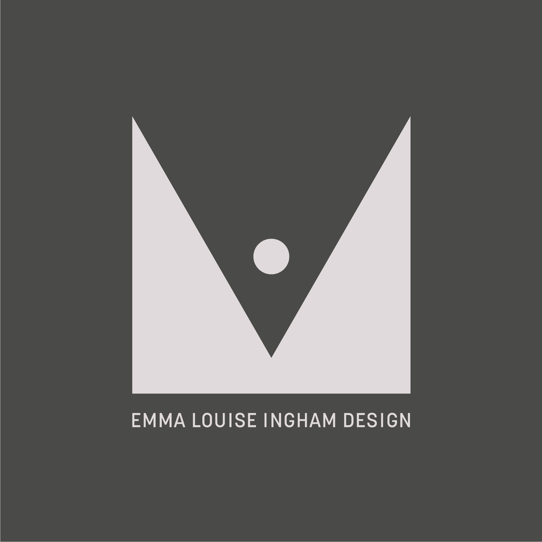
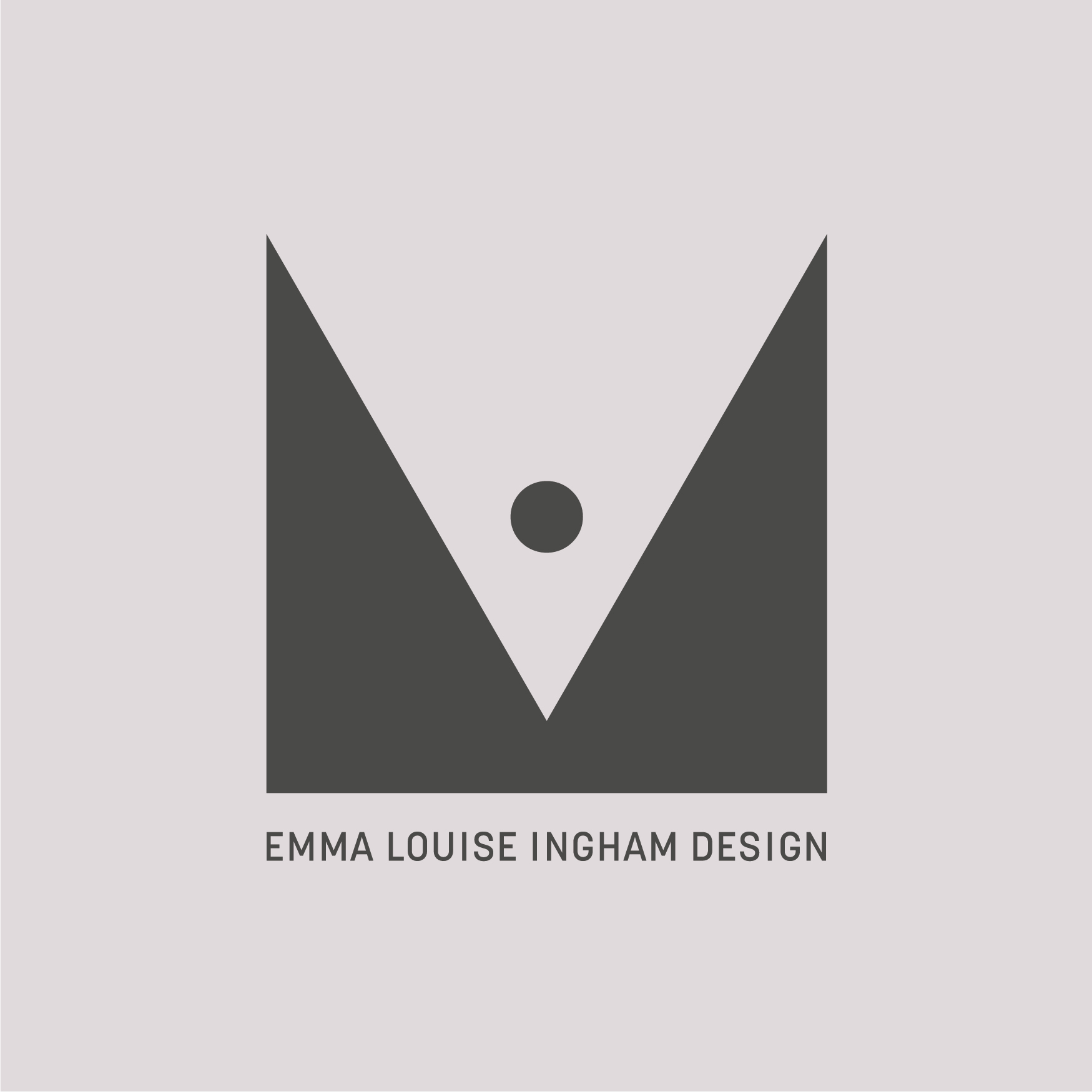
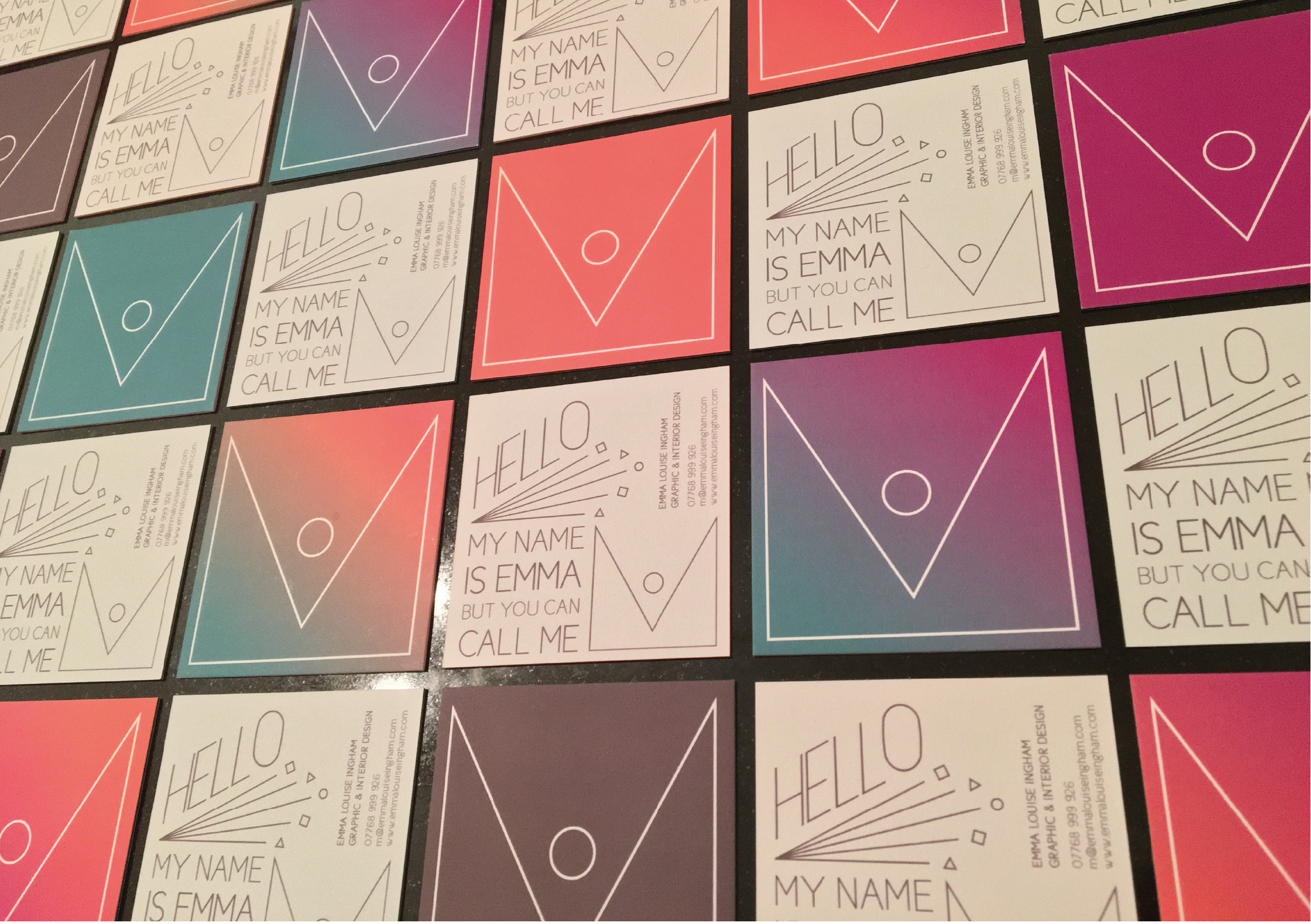
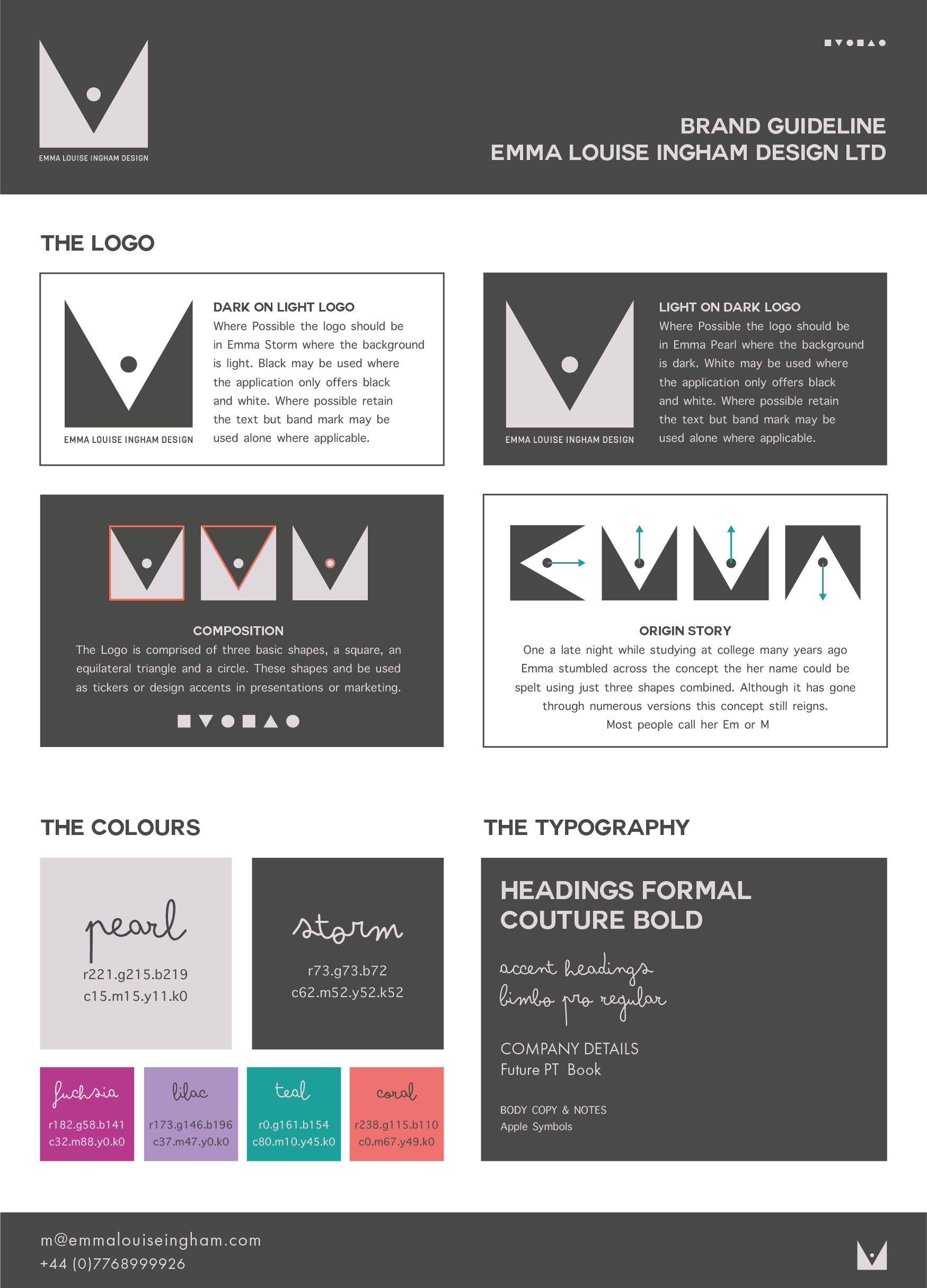
My very own brand was developed primarily through my love of the three basic shapes, the foundations of design; the circle, the square and the triangle. With my name being Emma most people shorten my name to Em or M as in James Bond so when I came up with this form the M side of the icon made the most sense to use.
If you rotate the shame it actually spells Emma.... check out my website launch video created by the lovely Diego Grafito to see it in action!
< LAST PROJECT | NEXT PROJECT >